Zunch rips me off on “SEO Report Card”
Nice.
Zunch Debuts SEO Report Card for SMBs
Um, that is the name of my column for Practical Ecommerce which I’ve been doing for the last 8 months. But I’m sure Zunch already knew that.
SEO Site Evaluation #3
The third of my SEO Report Cards for Practical eCommerce magazine led to the “deconstruction” of Stayleaner.com, the e-commerce site for J & J Health Foods who were relying heavily on pay-per-click advertising because they couldn’t get linked in the natural search listings. Yes, I felt their pain and on investigation found much search engine unfriendliness.Â
And not surprising because, with the exception of the anchor text and the disclaimer, there’s very little content on the home page. The text that’s there doesn’t develop a keyword theme around “vitamins” or “supplements.” Surprisingly, the word “supplements” isn’t even used once on the page!
For the rest of my findings, read the full article.
Partnering up has its advantages
Have you considered incorporating content partners and marketing partners into your online strategy? For example, partnering with content providers who could augment your own content with additional related content? Or partering with sites whose visitors match your target market? If, for example, you wanted to reach women online, you could partner with a site like iVillage.com and build a microsite together, then have them promote it through their site and subscription lists.
Think about the sites you advertise on as potential partners. Join forces and create a microsite together and then promote it to a joint captive audience. Or make a deal with them and syndicate some useful content onto their site. For example, you could develop a whole library of useful tips and, rather than doing standard banner ads, you could provide these tips to your partner, who would then fold it with the rest of their content. Et voila!… “Sponsored content”!
Even better if, between the two of you, you can develop some sort of “hook” or viral component, such as a funny video, an addictive game, a downloadable ebook, worksheet, calculator, widget, etc.Â
Got an example to share of a site where the whole is greater than the sum of the partners? Post a comment!
Ecommerce Best Practice Tip #12: Email customers who have abandoned their shopping cart
An effective way to recapture the potential customer who has abandoned their shopping cart is to send them a reminder email. Don’t do it right away. JupiterResearch recommends waiting at least 24 hours. I’d wait a few days. In the email show a photo of each item along with the product name, price, etc. just like you (hopefully) do on your View Cart page. Sweeten the deal, particularly if the person appears to be new-to-file, by offering a discount or incentive to complete their purchase. If you’re too predictable about it, customers may figure out what you’re doing and purposefully abandon their cart in anticipation of a discount. The last thing you want is this listed as a discount on coupon codes sites like dealnews.com. You may wish to send several more reminder emails spaced out over time after the initial one, continuing to up the ante with more irresistable offers with each successive email until you finally give up on them. PETCO’s reminder emails, sent 3 days after the cart is abandoned, included the abandoned product as the main feature along with cross-sells to three other high-margin items; these program-centric emails achieved a 852% increase in clickthrough rate and 171% increase in conversion rate over the company’s previous campaign-centric emails (as reported by MediaPost).
Of course it’s hard to send a reminder email if you don’t have the shopper’s email address. If the shopper is not a previous customer or is unidentified, have them identify himself/herself as early on in the ordering process as possible. In other words, have them provide their contact details / create an account / login (as an existing account holder) as one of the first steps of the checkout. Note that user accounts are an important feature for ease of repeat ordering and checking on order status. Through the use of cookies you should be able to also identify many of your returning shoppers without them logging in first.
This kinda goes without saying… If you’re going to provide a means for a shopper to be reminded of their cart contents, you’ll need to allow shoppers to add items to their “shopping cart” then leave that cart for extended periods of time and still have it remain intact. I’d keep their cart alive for 90 days or more. Sometimes shoppers will purposefully want to save their cart and return later to it. Consider having a “save my cart for later” option and/or “move items to wishlist” type feature to better cater to these people’s needs.
Received any shopping cart reminder emails recently? If so, were they any good? Is there a merchant you’d like to highlight who does this “recapturing” exceptionally well? Post a comment and let me know.
Ecommerce Best Practice Tip #11: Design that works
In a way, a good ecommerce website is a work of art. Form and function working together. An intersection of intuitive navigation, usable information architecture, an appealing look-and-feel, and attention to detail. An experienced web design company is more likely to have the skills necessary to deliver on that promise. When sites are developed by companies with little experience creating e-commerce sites, it usually shows.
What makes for good ecommerce site design? That’s hard to answer, because it’s so subjective. Beauty is in the eye of the beholder. You could survey “the man on the street” and see what he says about your site. We’ve all seen plenty of sites where the design looks shoddy, amateurish, cluttered, hokey, or otherwise lacking. Here’s a random example that I just happened across while searching Google; the site definitely needs some attention.
Sometimes it could be that the design just needs some finessing rather than a total gutting. It’s amazing what a bit of detailing work can do. Consider this before and after that I discussed in a recent Practical Ecommerce article. It still looks like the same company, but it’s an attractive facelift (IMHO) with SEO and conversion optimization built-in.
Ecommerce Best Practice Tip #10 – Incorporate “breadcrumb navigation”
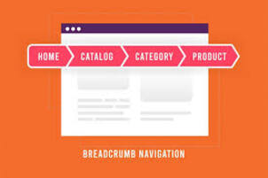
Breadcrumb navigation is wonderful for usability and for search engine optimization (SEO). Breadcrumb navigation, if you’re not familiar with the term, is text-based navigation that shows where in the site hierarchy the currently viewed web page is located. Not only does it give a sense of your location within the site, it provides shortcuts to instantly jump higher up the site hierarchy. A product page for a table lamp may have the breadcrumb navigation of “Home > Home Furnishings > Lighting > Table Lamps”. Below is a screenshot of an actual breadcrumb taken from a page within the website of one of our clients, TriTech:

Notice that the breadcrumb above contains text links with relevant keywords in the anchor text. This provides a significant SEO benefit. Let’s take the “Phone Systems” link in the above breadcrumb as an example. The search engines treat that single link as a “vote” for the Phone Systems category page. But more than that, the anchor text (“Phone Systems”) provides the search engines (Google, Yahoo and MSN Search) with an important contextual clue as to the topic of the linked page. That equates to improved rankings.
Contrast that with the use of throwaway phrases like “click here” or “more info” in the anchor text. Such words provide no clues as to the topic of the linked page, for either the search engines or your users. When you use the phrase “click here,” you are telling the engines that the page to which you are linking is all about “click here”.
One throwaway phrase that’s used almost universally within breadcrumbs is “Home”. Try revising that link to something more keyword-rich. Take the “Home” link in TriTech’s breadcrumb above as an example. A more search optimal version of the anchor text would include words like “Computing” or “IT” or “Technology” along with perhaps “Store” or “Products”.
Now consider the amplifying effect of breadcrumb navigation. A link in the breadcrumb will be “voted for” (through internal links) more times if that linked page is higher up in the site hierarchy and if there are more pages underneath that page in the hierarchy. So, through breadcrumbs, a super-category page will receive more internal links than a sub-category page, and a category page for a category covering hundreds of products will receive more internal links than one with only a dozen products in the category.
Make a breadcrumb for the checkout too, to give shoppers a bird’s eye view of the order process and an indication of how much farther they still have to go. Ideally allow them to use the breadcrumb nav to jump around in the order process too, like to change billing or shipping information that they had already supplied in a previous step. Here’s Air New Zealand’s breadcrumb from their booking engine (shrunk a bit to fit):

Some sites take the visitor’s clickpath into account when building the breadcrumb, rather than relying totally on the absolute site hierarchy. For example, RitzCamera.com will display a different breadcrumb on a CompactFlash memory card product page if you navigated to it from the top-level category of “Memory” versus the top-level category of “Digital Cameras & Accessories”.
This can have implications on the site’s search engine friendliness. How? Well, the user’s breadcrumb trail needs to be passed in some way, and it’s often put in the URL rather than a cookie. If in the URL, that will create multiple copies of near-duplicate pages for the search engines (where the only difference between the pages is a variation in the breadcrumb). The end result is PageRank dilution.
There are several potential workarounds (besides the obvious one of disregarding the user’s clickpath altogether). One is to drop this breadcrumb trail from the URLs of internal links selectively for search engine spiders, through user-agent detection. An alternative workaround is to append the parameter containing the breadcrumb trail to the end of the URL using JavaScript. An example of this technique is REI’s Shop by Brand pages, which append a vcat parameter upon clicking on any of the brand links. Either approach will minimize duplication and aggregate PageRank. Neither approach will eliminate the potential for websites deep-linking to you with the breadcrumb trail parameter included (via copy-and-paste of the URL displayed in their browser’s Location bar).
This all might seem to hard. In fact, implementing breadcrumb navigation AT ALL may be too hard. If that’s the case for you, there’s still a potential path forward, where you can still reap some SEO benefit. I call the approach a “poor man’s breadcrumb”. Basically, you just link to the category that you are in, and that’s it. This approach worked well for our client Guild.com. They didn’t have time to code in the necessary functionality for breadcrumb navigation, so this served us in a pinch. You’ll notice on all pages showing multiple products on a page (example: page 10 of 31 of glass vases) that they all link to their category page, like so:

For this example, that equates to 31 pages voting for the Glass Vases category page with keyword-rich anchor text.
So now you have learned probably more than you ever wanted to learn about breadcrumb navigation! To summarize all of the above: incorporate breadcrumbs into your online catalog and your checkout, try to make the anchor text keyword-rich, and don’t incorporate a spider’s clickpath into your breadcrumb if you can at all help it.
Toolbar PageRank update is currently underway
Yay! It’s another toolbar update underway, as I type!
“So what. Who cares?”, you may be saying to yourself.
I’m not normally an obsessive PageRank Meter watcher, but I have been keeping a closer eye on it lately because a little technical snafu one of our junior developers made to our Netconcepts.com server config temporarily zereod out our score on the meter. But today it’s back! We’re a PR7 yet again.
If you’re wondering what happened that we could zero out our PageRank score, here’s the story… One of our programmers had mistakenly copied over a “bad bots” server configuration file (which includes email harvester bots and other such nasties) from a development server to our production server. What he didn’t realize was that file was set to turn away Googlebot as a bad bot because we didn’t want our development sites getting included in Google. This snafu happened a while ago now and it had long since been corrected. It didn’t take long to notice something was amiss because pages started dropping out of Goog’s index. After allowing Googlebot again, within a few days our pages returned to the index and our rankings returned too, but not our PageRank readout from the toolbar server… until now!
Note that our PageRank score as reported in the Google Directory has been unaffected. We’ve stayed at the top of our category page. Out of hundreds of web design agencies beginning with the letter N, no one has a higher PageRank than us (listings are in order of PageRank). (I know you’re saying “Ooooh!!” to that! hehe). The reason for the lack of movement: The last Google Directory PageRank update was December 19 last year. (SEOcompany.ca estimated the next GDPR update would be March, but it still hasn’t happened yet.)
So clearly PageRank updates to the toolbar server and to the Google Directory don’t happen simultaneously. In fact, Google Directory PR updates generally happen less frequently than Toolbar PR updates, as you can see here.
Of course, both are months out-of-date so it’s best not to base your business upon these readouts.
“For entertainment purposes only”, as they say.
Your link building strategy, PageRank, and other pieces of the linking puzzle
Link building is not all about transferring PageRank. Don’t get caught in the trap of basing your decision on high PageRank score alone. There are other considerations to be taken into account.
For example, your backlinks need to represent a range of importance scores (PageRank) so that Google doesn’t construe your link network as unnatural. Building links exclusively or mostly from high PageRank endowed sites may flag your site for artificially trying to boost your PageRank. And do you really want to attract additional scrutiny?
For long term benefit and security, sites that are selected for inbound links should be from an on-topic neighborhood, have aged domains, and if possible, have .edu and .gov sites in there. The list of sites needs to be analyzed to ensure that there are no technical limitations that slow the flow of “link gain” (e.g. PageRank). For example, the directory Gimpsy.com has let pages with session IDs (“PHPSESSID”) in the URLs slip into the indices, which makes it less ideal as a backlink.
In general, all links help (unless from “bad neighborhoods”), regardless of their PageRank. Some of the links NEED to be topically-relevant or your site is going to appear unfocused and the links won’t appear to have been “earned,” but instead bought, borrowed, bartered or stolen.
Directory submissions should be a component of your link building strategy, but don’t put too much emphasis on them. As Stuntdubl says, you need to balance the link equation and not rely too heavily on directories, and you need to spread your submissions out over time.
Certain directories are considered to be “hubs” or “authorities” or both (unfortunately only the search engines know which ones, so try to cover your bases as best you can), in which case it may be used by a search engine as an indicator of the topically-relevant neighborhood that your site belongs in.
Bear in mind that toolbar PR scores are months old and can’t really be trusted. The REAL PageRank is outside of our grasp, locked up within the Googleplex.
Also bear in mind that PageRank is Google-specific. That’s not to say that you can’t use PageRank to make some inferences about the importance of a page in the eyes of Yahoo! and MSN Search. The concept of “link gain” or weighted link popularity is alive and well at Yahoo and Microsoft, they just have different ways of calculating it and names for it. At Yahoo it’s been referred to as “Web Rank” and “link flux” (a term from their days at Inktomi). I don’t know what MSN calls it. The higher the PageRank, the more useful it is as an indicator of a powerfully important site across all 3 engines. For example, I’d have little doubt that a PageRank 9 link would be an amazing link opportunity that would reap benefits across Google, Yahoo, and MSN Search.
How can old-media execs be this clueless?
This is comical:
Yesterday, Shaw told MediaDailyNews that his network has been talking to cable operators about disabling the fast-forward button on their digital video recorders to prevent commercial skipping. Wait, wait … the kicker is that he doesn’t think this would be any big deal to the audience. “I’m not so sure that the whole issue really is one of commercial avoidance,” Shaw said. “It really is a matter of convenience — so you don’t miss your favorite show. And quite frankly, we’re just training a new generation of viewers to skip commercials because they can. I’m not sure that the driving reason to get a DVR in the first place is just to skip commercials. I don’t fundamentally believe that. People can understand in order to have convenience and on-demand (options), that you can’t skip commercials.”
(from Good Morning Silicon Valley)
We’re becoming an increasingly time-poor society, and this is ABC’s answer? Oh brother!
Juxtapose that old media philosophy with new media businesses, like the super-cool jumpcut service where you can effortlessly edit and re-mix others’ published videos. Guess which one is clued in to the future and which one is hopelessly caught in the past!
The execs at ABC clearly need to read The Cluetrain Manifesto.
Ecommerce Best Practice Tip #9 – a slippery shopping experience
Shopping cart abandonment is of primary concern to online retailers, and for good reason. If real-world stores were like their virtual equivalents, there’d be so many shopping carts littering the aisles the shoppers would have to literally climb over them!
The best kind of ecommerce site is one where the shopping experience is smooth and easy – slippery in fact. Whether you whip out your credit card or not is a foregone conclusion – you are swept away in the moment. The epitomy of this is Amazon’s “1-click ordering”. If I stumble upon a product I like on Amazon, I can own it within a single click of the mouse.
Here are some tips to make the shopping experience a slippery one, which will hopefully equate to less abandoned shopping carts in your virtual checkout aisle:
- Eliminate steps in the checkout process where it makes sense. Just remember that fewer is not always better; it depends on whether the checkout pages remain uncluttered and uncomplicated after consolidating steps.
- Let shoppers know where they are in the process with a progress indicator on each checkout page.
- Let shoppers see what they have selected already with thumbnail images inside the shopping cart.
- Allow shoppers to edit their selections easily. Revising color and size options of items in their cart should be painless.
- Show them you are real. Assure shoppers by providing your full contact details including physical address. I as a shopper don’t trust sites that are completely “virtual” — i.e. no physical address, no company info, no photos of staff — and I’m sure I’m not alone in that sentiment.
- Recommend other items based on what is already in the shopping cart (i.e. cross sell and upsell).
- If you are competing on price, offer a price guarantee.
- If, after all that, the customer abandons the shopping cart, find out why. Offer them an incentive to complete an exit survey. It will reveal a lot about the shopping experience you are providing your customers.


